
Keeping ADN's DNA while embracing the new
Strategic rebranding, creative direction, and graphic design.
After more than 20 years, ADN Comunicación was growing: new offices, a bigger team, and more digital work. Its identity hadn't caught up. As Art Director, I led the rebranding of the agency I worked at, with one goal in mind. Help the brand grow without losing the spirit people loved about it.
My role
Art Director. Creative direction, brand strategy with the copywriting team, logo, visual system, and applications.
Team
Me. 2 Executive creative directors. 1 Copywriter.

Context and starting point
Before: an identity ready to evolve
The original logo meant a lot to the people who had built the agency. But its heavy, rigid shapes no longer matched who ADN had become. The team was now warmer, more collaborative, and much more digital.
It was also a very special client. We were redesigning our own brand, for a team of creatives who would look closely at every detail.
So the challenge was clear. How do we move forward without losing what gave the brand its meaning?


The process
Listening first
Before sketching anything, I talked with the founders and the team to understand what they were proud of in the old brand and what no longer felt like them. Together with the copywriter, we defined the brand's personality, values, and tone of voice. Five words guided every decision: familiar, close, warm, collaborative, and professional.


Two paths, one shared decision
I presented two directions. A conservative one, refining the existing logo, and a bolder one with a full redesign. I knew how attached the team was to the original, so I wanted them to choose with both options on the table. They chose the bold one.
Key decisions
What stayed. The ADN letters, the word 'comunicación', and orange as the signature color. These were what people recognized, so they became the bridge between the old brand and the new one.
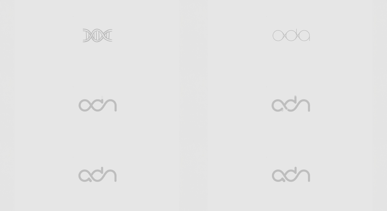
A logo built on connection. The letters join in one continuous line that evokes a DNA strand. It's a nod to the name and to how the agency works, side by side with its clients. Rounded, lowercase shapes make it feel closer and friendlier than the old heavy italics.
A brighter palette. The same orange, more saturated, to bring energy, especially on screens.
A flexible visual system. Illustration, motion, and photography that give the team room to play and experiment in every piece.
Outcomes
A brand that grew with the agency
The team and clients welcomed the new brand from day one. It gave ADN a fresher, more coherent presence that grew along with the agency: new offices, a bigger team, and new clients such as 3M, Iveco, Case IH, New Holland, YPF agro, among others.
Years later, the identity is still in use. For me, that's the best sign that it truly feels like theirs.


Let's talk!
damer.flor@gmail.com